How to design App Store screenshots in 2026
Design App Store screenshots that follow Apple's rules: what the first three slides should show, captions, order, device frames, panoramas and tools.
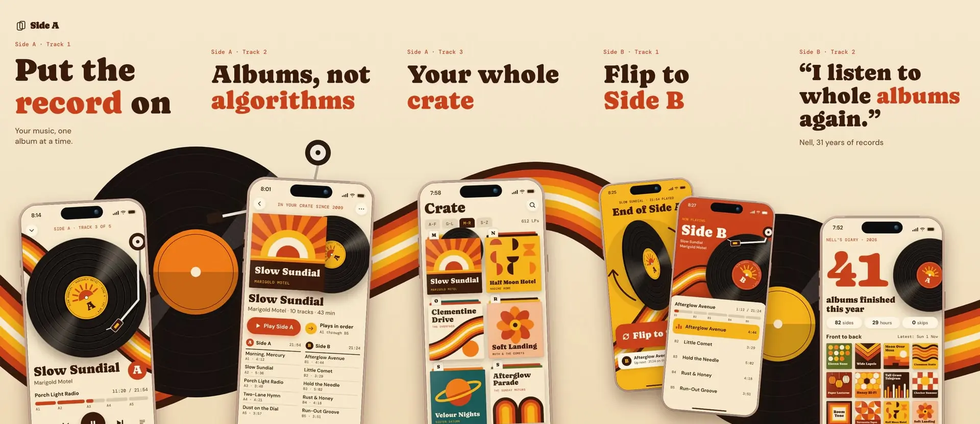
To design App Store screenshots, follow these six steps and keep one rule in mind. Most slides have to show the app in use, because App Review counts them.
- Pick one build size. For iPhone, use 1206 × 2622, the size App Store Connect's iPhone box takes, and it scales down for smaller phones. Add 2064 × 2752 if your app runs on iPad. The rest are in App Store screenshot sizes.
- List five or six reasons to download, best first.
- Capture real screens with made-up account data.
- Write one short caption per slide.
- Add device frames if you want them, and keep one visual style across the set.
- Export JPEG, or PNG with no alpha channel, then upload and check the order.
The rules below come from Apple's asset best practices, guideline 2.3.3 reference and screenshot specifications, checked in November 2026. We're Intenseloop, and we make AppScreen (appscreen.pro), a screenshot editor.
What to put on the first three slides
Apple says, "Depending on orientation, up to three screenshots can appear in search results." Those slides sit beside your competitors before anyone opens your page. An app preview or in-app event can take that spot, and on iOS 27 and iPadOS 27 so can a search results creative asset.
Here's how that works for a made-up budgeting app.
Slide 1 says what the app is. A stranger should be able to name the category in a second. Show the main screen in a useful state under a caption like "See where your money went". A logo on a gradient fails, and guideline 2.3.3 says screenshots should show the app in use, "not merely the title art, login page, or splash screen."
Slide 2 shows the main task. Catch the app mid-action, with an expense half entered. You want someone to picture doing it.
Slide 3 answers "why this one?" Use the feature that separates you from the apps beside you in search. Your reviews often say what it is.
You'll read that 90% of people never scroll past the third screenshot. We looked for the study behind that number and found only blogs and vendor reports with different figures. Apple's line about search results is reason enough.
How to write captions
Apple says: "If using text, use a short phrase that enhances your visual rather than describes it."
- Say what the person gets. "Every run on one map" beats "Activity screen".
- Stay under two lines. Aim for six words or fewer, because translations run longer.
- Set them large. Start at about 8% of the slide's width, which is 96 px on a 1206 px slide. Then check on a real phone.
- Keep the font, color and position the same on every slide. Apple asks for "similar visual style" across your assets.
- Leave out what Apple rules out. No specific prices, discounts, URLs, copyright symbols, unverifiable claims, or Apple recognitions like Editor's Choice.
How many screenshots, and in what order
Apple allows 1 to 10 per device size, and one is enough if it shows the app in use. Ship five or six that each say something new.
Apple asks you to sequence them "so they tell a cohesive story that's reflective of how someone would use your app or game." Start with the three slides above, then your next most-used features. If you support Dark Mode, Apple suggests showing it at least once.
A marketing-only slide like a review quote is allowed if most others show the app, but Apple says to avoid filling an image with accolades or calls to action. We'd skip it.
Do screenshots need a device frame?
No. Apple's 2.3.3 page doesn't mention frames, and a plain capture is fine. We'd still use one, because a shrunken screen reads better inside an outline and leaves room for the caption.
- Match the device. Apple's example says slides "must show the app in use on that device", so an iPad set needs your iPad interface, not a stretched phone.
- Keep other platforms out. Guideline 2.3.10 bars names, icons and imagery of other mobile platforms, and Apple's reference page calls out status bars. Don't reuse Android captures in an iOS set.
Tilted phones are a gray area. Apple's marketing guidelines say to use its own product bezels unmodified, with no cropping or tilting. That page never mentions App Store screenshots, and the 2.3.3 page doesn't mention tilting. We treat it as a rule for ads, which is our reading, not Apple's.
Panorama or separate slides?
We'd build a panorama. It's one wide image cut into slides, so a background or phone runs across the seam, and Apple allows it: "An image of an app in use can be displayed across multiple screenshots."
A connected set gives people a reason to keep going. A phone cut off at the edge of one slide invites the next swipe, and separate slides have nothing pulling you on. A background that runs through every slide also keeps the set in the "similar visual style" Apple asks for, with nothing to match by hand.
Two rules keep a panorama working:
- Each of the first three slides makes sense alone. A search result has nothing to swipe to.
- A caption never crosses a seam. Keep each one inside its own slide.
Settle the order before you export. Dragging slides in App Store Connect breaks the seams, so change the order or a crossing screen in the panorama and export again.
The rules Apple enforces
Files
- 1 to 10 screenshots per device size, as
.jpeg,.jpgor.png. - "Images can't include alpha channels or transparencies."
- Exact pixel sizes only. A 13-inch set is required if your app runs on iPad.
- The required iPhone slot is the medium Dynamic Island size, 1206 × 2622 or 1179 × 2556. App Store Connect refuses other sizes there with "File dimensions are invalid", 1284 × 2778 included.
- iPhone Duo screenshots become required in April 2027 for apps using the iOS 27.1 SDK or later.
Content
- App Review "will approve only those submissions where more than half of screenshots show the app in use." Three slides need two, and four need three. Apple applies this to each device's set and each localization.
- Overlays are fine if "the primary app functionality in the screenshot isn't obscured", and "Don't let overlays or marketing visuals crowd out your app."
- Don't misrepresent the interface. Update screenshots with each version so they match.
- Guideline 2.3.8 asks for images that suit a 4+ age rating, even if your app is rated higher.
- Guideline 2.3.9 makes you responsible for the rights to everything shown, and says "you should display fictional account information instead of data from a real person."
The tools people use
AppScreen. Our pick, and we built it for this job. Every slide sits on one panorama canvas in your browser, so a phone or gradient can cross a seam, including on Free. You export upload-ready PNGs per slide at store sizes, or the whole panorama, for the App Store and Google Play. Free needs no account or card, saves 3 projects in your browser and has iPhone and Android phone frames. The first 3 slides of a panorama export clean, and those are the ones search results can show. Slides after the third carry a watermark on Free, as does every slide of a Pro template or tablet size, and Pro removes it. Pro is $9, paid once, and adds iPad and Android tablets, patterns, cloud save, version history, share links and agents over MCP. Open the editor or browse the 50+ templates.
Figma. It has a free tier and many Community templates, and you set up every size and export yourself. See App Store screenshots in Figma.
fastlane. Its snapshot tool automates capture across devices and languages, and frameit adds frames and text. It takes setup.
Other dedicated editors and their prices are in this roundup.
Shipping on Android too? iPhone screenshots are too tall for Google Play's 2:1 limit, so build a separate set from the Google Play sizes.
Test it once you have traffic
Apple's Product Page Optimization tests up to three alternate versions of your icon, screenshots and previews against your original, for up to 90 days, one test at a time. Apple says to "consider how many elements you change", so change only the first slide.
To build your first set, start from a template.
SourcesEvery number in this post comes from these pages.11 pages · Checked 3 Nov 2026
- developer.apple.com/app-store/asset-best-practicesCaptions, order, banned content, search results
- developer.apple.com/help/app-review/guideline-reference/2-3-3-screenshotsMajority rule, overlays, spanning slides
- developer.apple.com/app-store/review/guidelinesGuidelines 2.3.3, 2.3.8, 2.3.9, 2.3.10
- developer.apple.com/help/app-store-connect/reference/screenshot-specificationsLimits, alpha, scaling, required sizes, Duo
- developer.apple.com/help/app-store-connect/manage-app-information/upload-app-previews-and-screenshotsMedia Manager, View All Sizes
- developer.apple.com/app-store/product-pageSearch results, Dark Mode
- developer.apple.com/app-store/marketing/guidelinesBezel rules, cropping and tilting
- developer.apple.com/design/resourcesProduct bezels
- developer.apple.com/app-store/product-page-optimizationWhat can be tested, limits
- docs.fastlane.tools/getting-started/ios/screenshotssnapshot and frameit
- figma.com/pricingFree Starter plan
Something out of date? Email support@appscreen.pro and we'll re-check it.